WORK > PRINT
Tags: editorial, post cards, brochures, books, bookmarks etc.
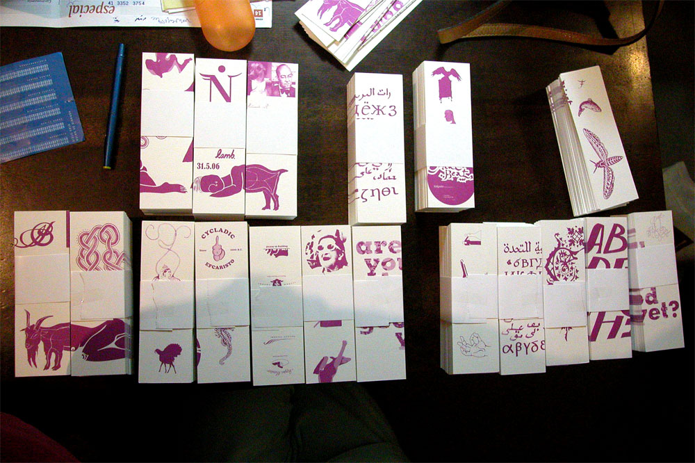
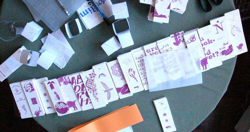
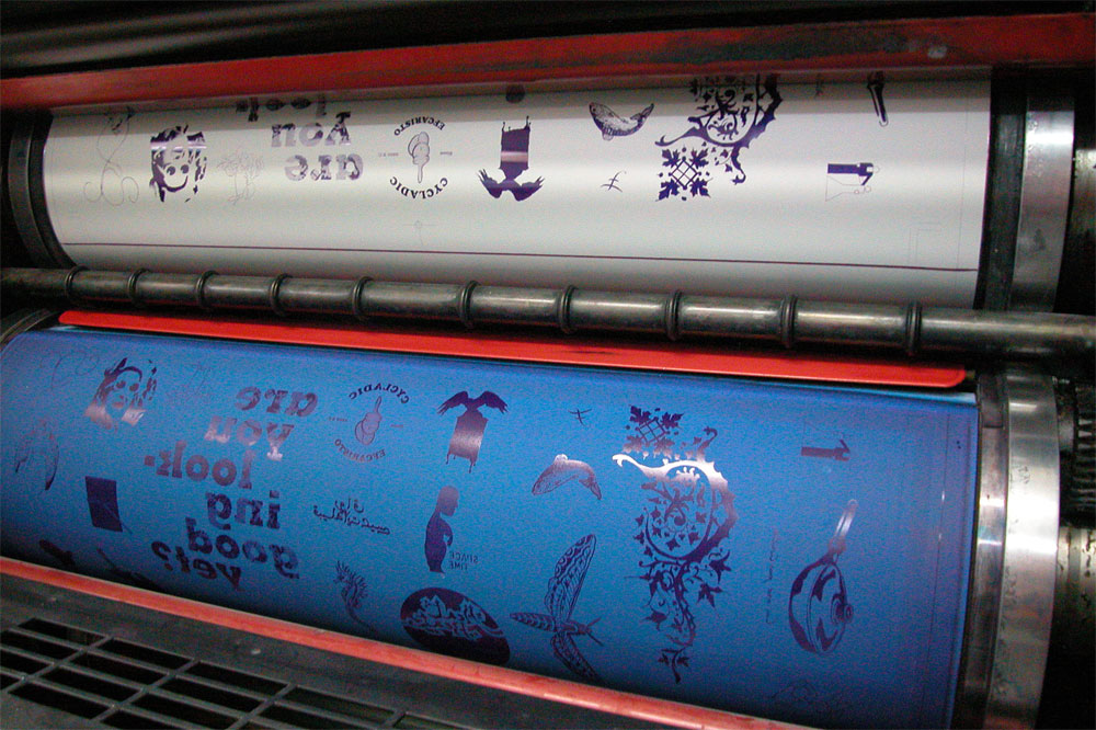
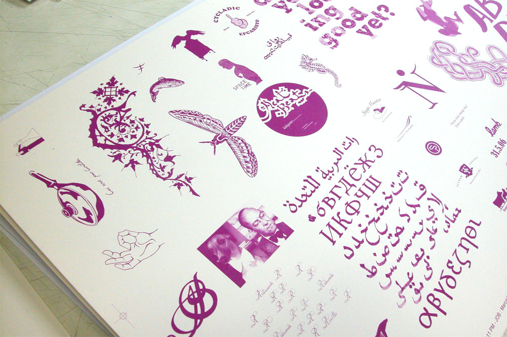
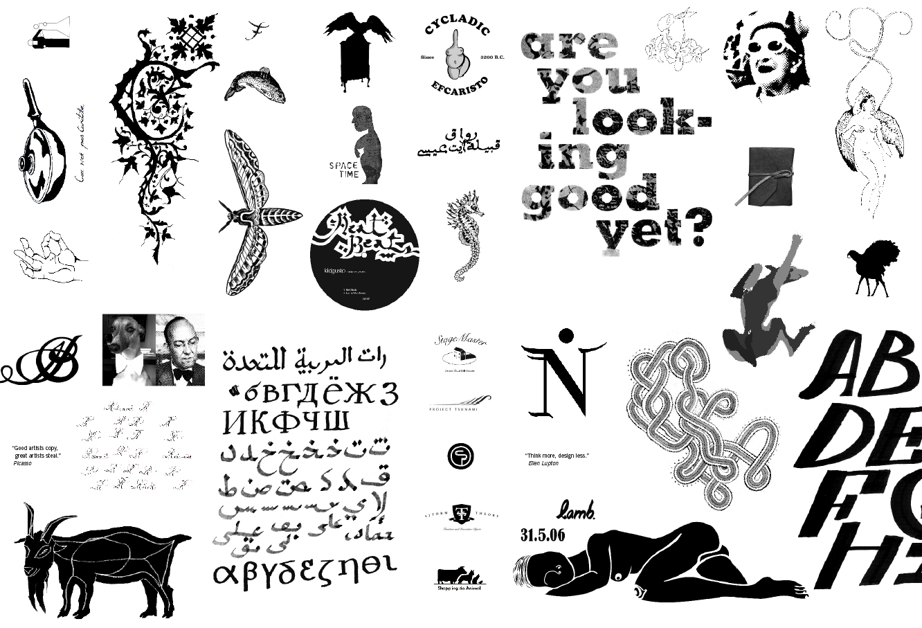
Vernacular Media Transformations
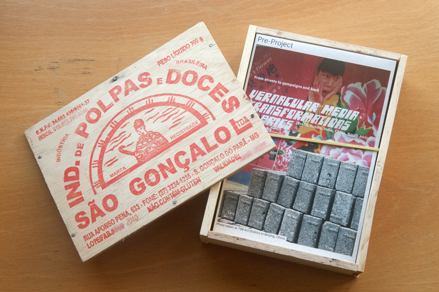
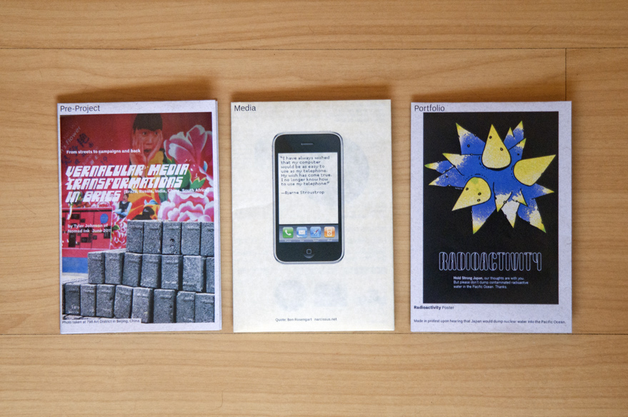
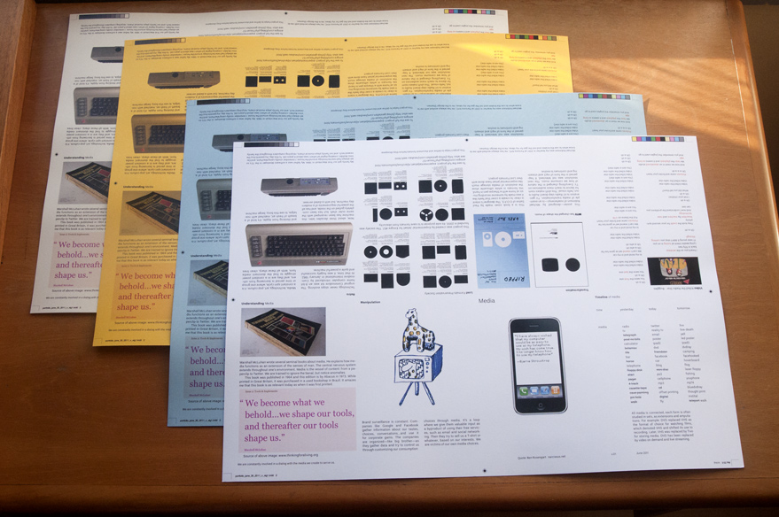
Three small publications were created as a pre-project for graduate school entry. From left to right: Vernacular Media transformations in BRICS, Explorations in media, Nomad Ink's portfolio. Project was a success, as it landed an offer letter from Central St. Martins in London, and ESAD.PT in Portugal. To help add to the concept of vernacular, a traditional box, commonly used to transport sweets in Brazil, was used to contain the booklets.
Curitiba, Brazil
2011
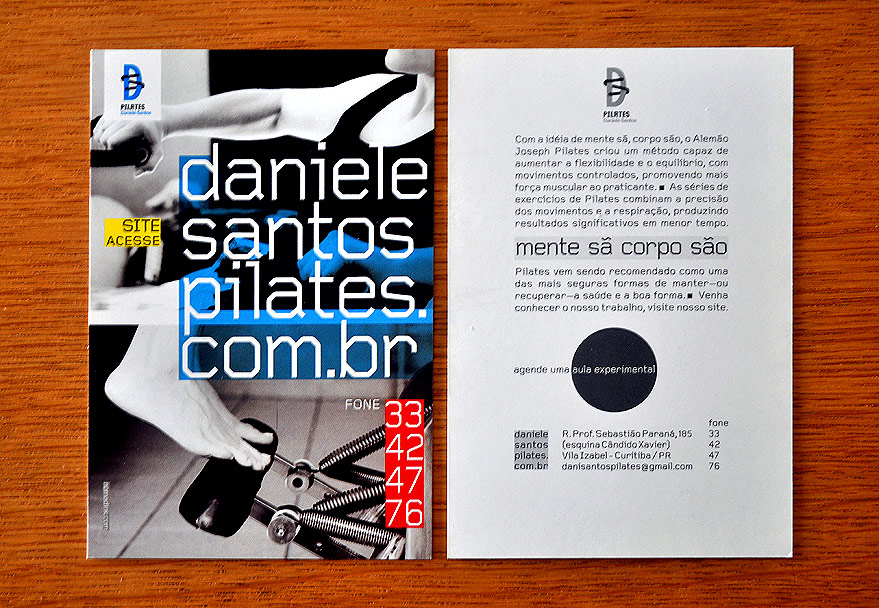
Dani Santos Pilates
This printed flyer is part of a total redesign of this popular pilates studio in Curitiba, Brazil. The dynamic of the work from the start has been edgy and exciting, often borrowing from several modernist movements, with 100% faith from the client to the designer, always a great relationship. Nomad Ink's work for Dani Santos Pilates has been highly effective, the studio has been a massive success, training 100s of instructors using materials we designed, and Dani Santos Pilates has completed 15+ years and opened a second location.
Curitiba, Brazil
2007
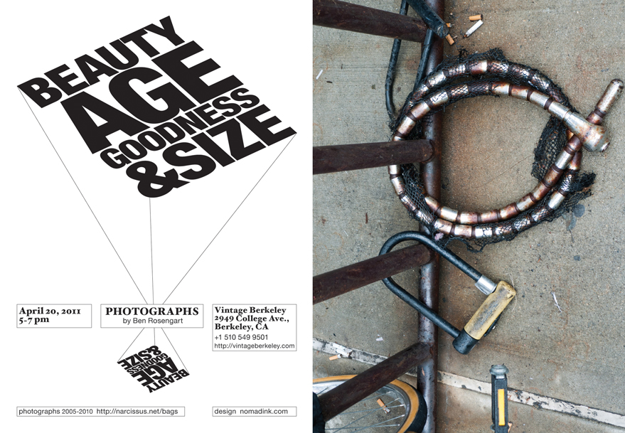
Beauty, Age, Goodness and Size
Flyer created for a San Francisco Bay Area photography exposition by Ben Rosengart, a web and database developer who also takes pictures in his spare time. The theme for the show was B.A.G.S.*, Beauty, Age, Goodness and Size, which is about the placement system for French adjectives.
*A few short, descriptive adjectives, usually expressing beauty, age, goodness, and size (you can remember this with the acronym “BAGS”), generally precede the nouns they modify: Beauty: beau (beautiful, handsome), joli (pretty) Age: nouveau (new), vieux (old), jeune (young).
Berkeley, CA, 2011
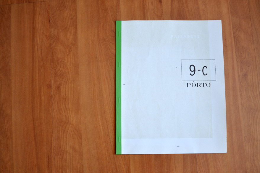
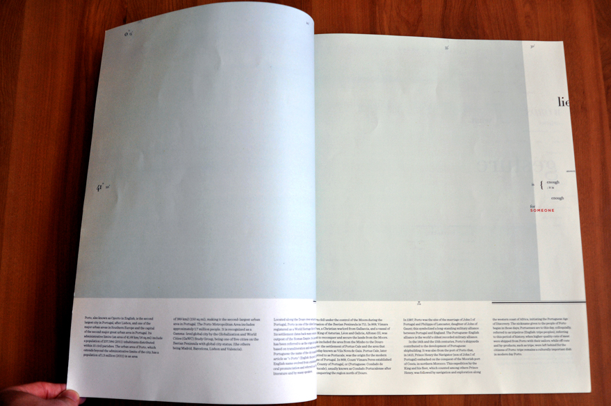
O Porto
Publication about the history of Porto using an old maritime map as a source of inspiration. Texts from Italo Calvino's "Invisibe Cities" were used to create a strong typographic mark with poetic phrases, juxtaposed against the sparse map and organized historical information.
Porto, Portugal, July, 2013.
A3
N Design Brasilia
For our first big speech as a studio, at N Design Brasilia, we created these bookmarks featuring some of our illustration and type work on the front, and some references for the students on the back. We had about 750 students in the large auditorium, with a line around the corner to get in. We had just finished our first "Study Tour" called Europa 2015.
Brasilia, Brazil
7" x 1 3/4"
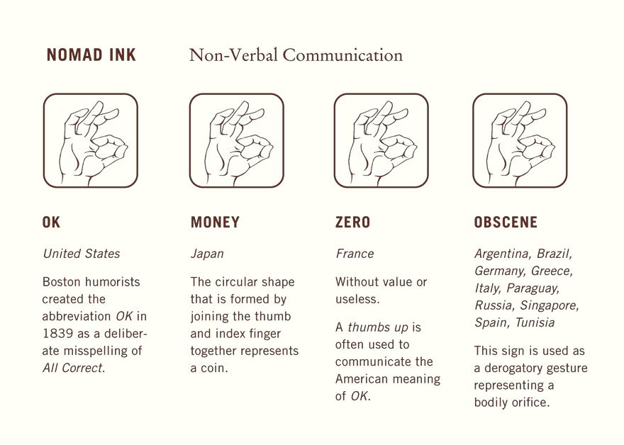
OK Postcard
Postcard showing multiple meanings of this simple hand gesture. Created as the first promotional item to represent the studio, the studio made 500 of them in offset with special paper from Inventario, and saved costs by using a single color, a rich dark brown, printed on off-white heavy stock. They were handed out to prospective clients & students. Cross cultural from day one.
2004, Curitiba, Brazil.
A5
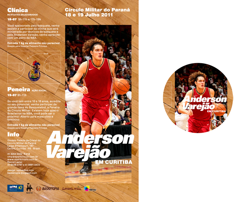
Varejão's basketball clinic
In 2011 we created a flyer and marketing materials for a basketball clinic in Brazil featuring prominent NBA player Anderson Varejão to Curitiba, Brazil. The event was focused towards the kids, and became a highly anticipated and successful event.
Curitiba, Brazil
A5 Flyer & 3" button
Selected works
PrintProject type
PostersProject type

IllustrationProject type
IdentityProject type

Do Not Feed the Lions[Case Study] Information Design
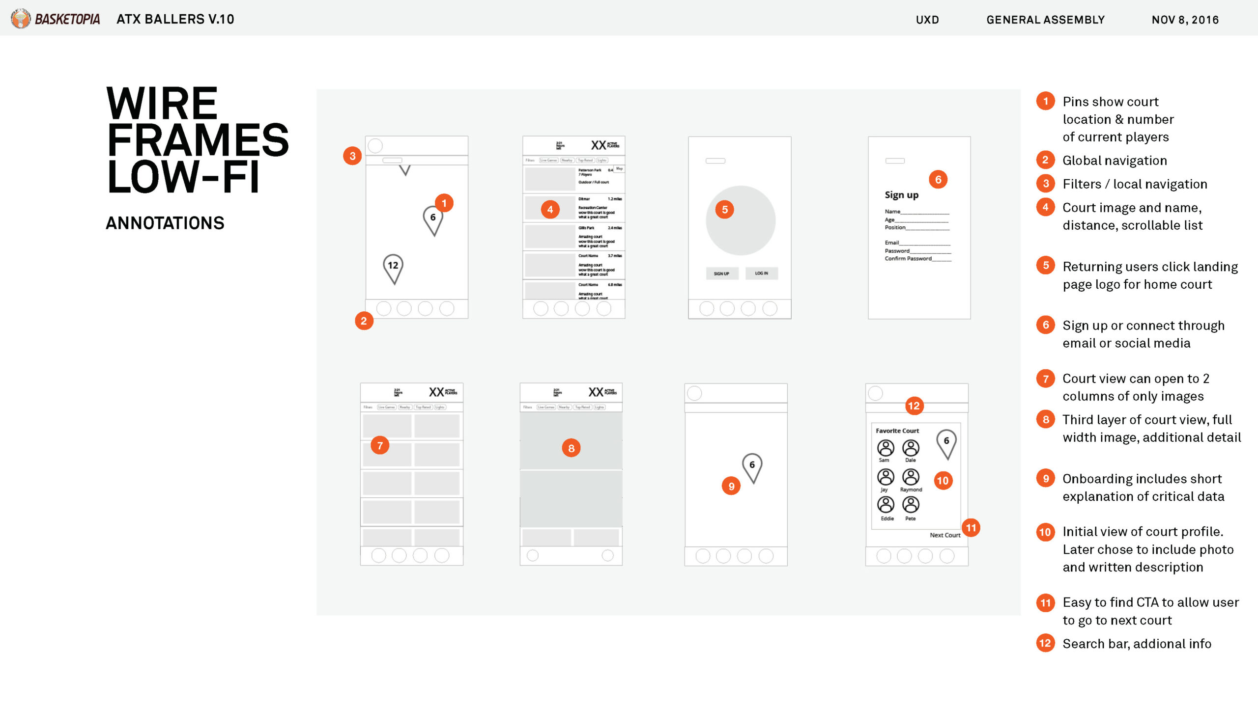
ATX Ballers[Case Study] UX Design

LetteringProject type

InvitationsProject type
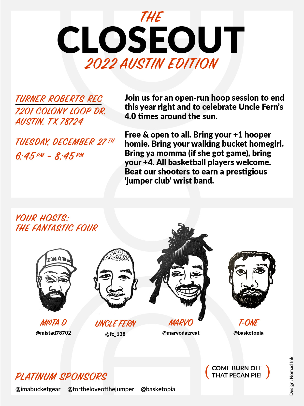
Basketopia[CASE STUDY] BASKETBALL BRAND